UI Concept
How can harbor managers improve their overall task completion?
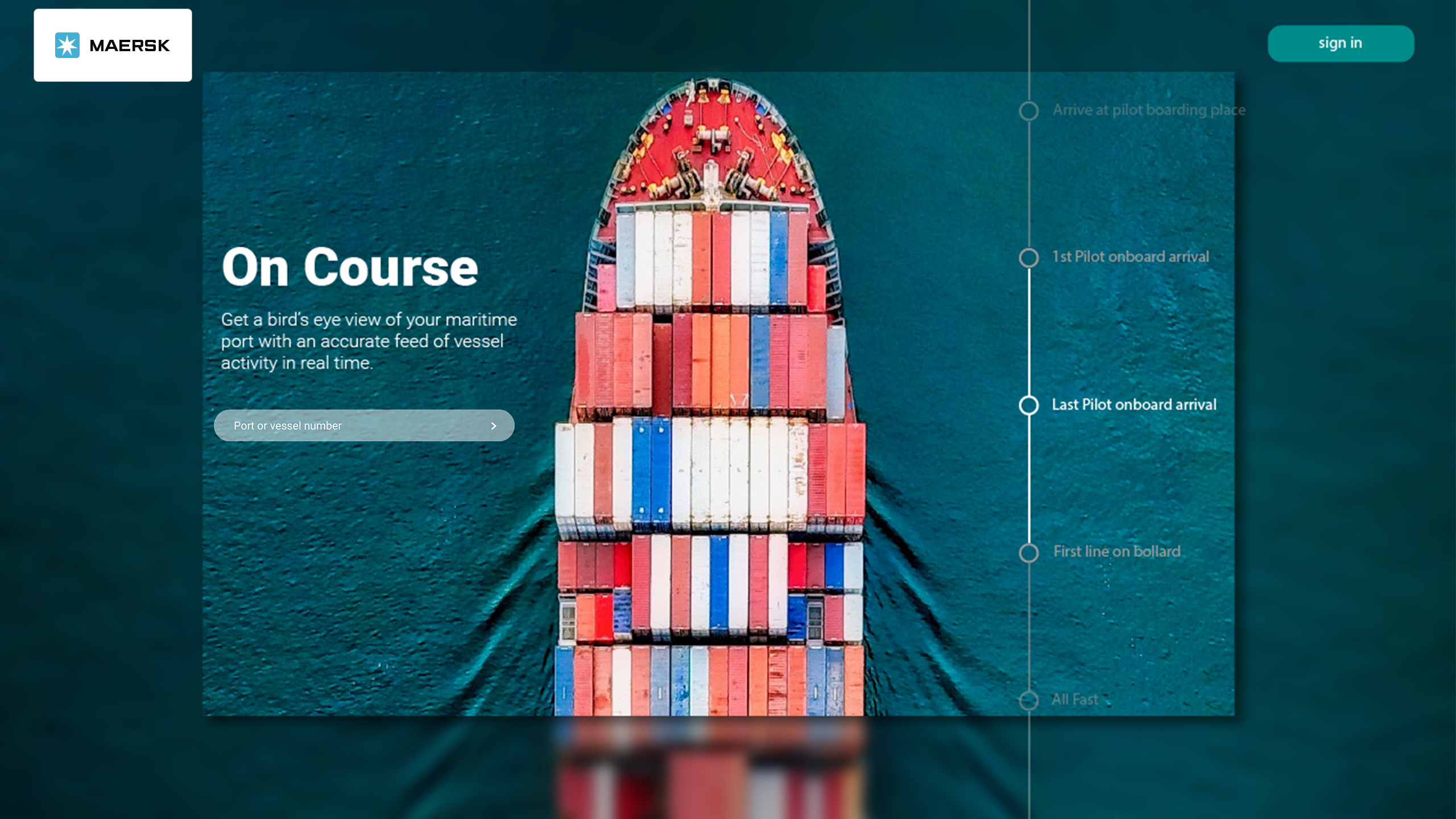
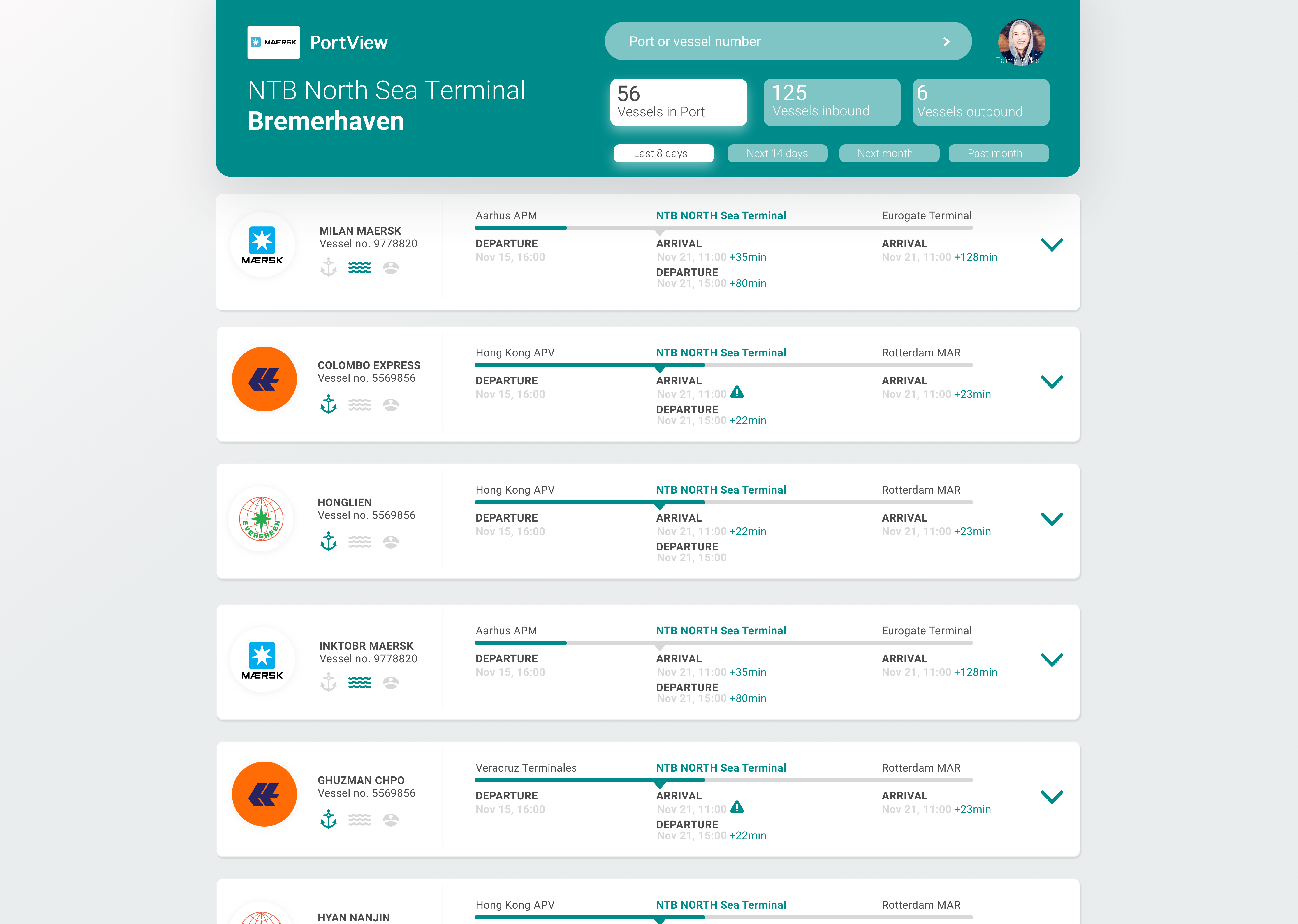
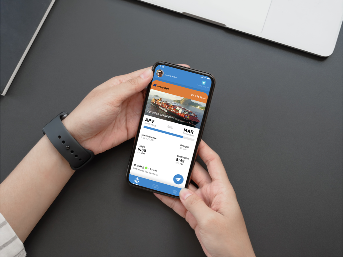
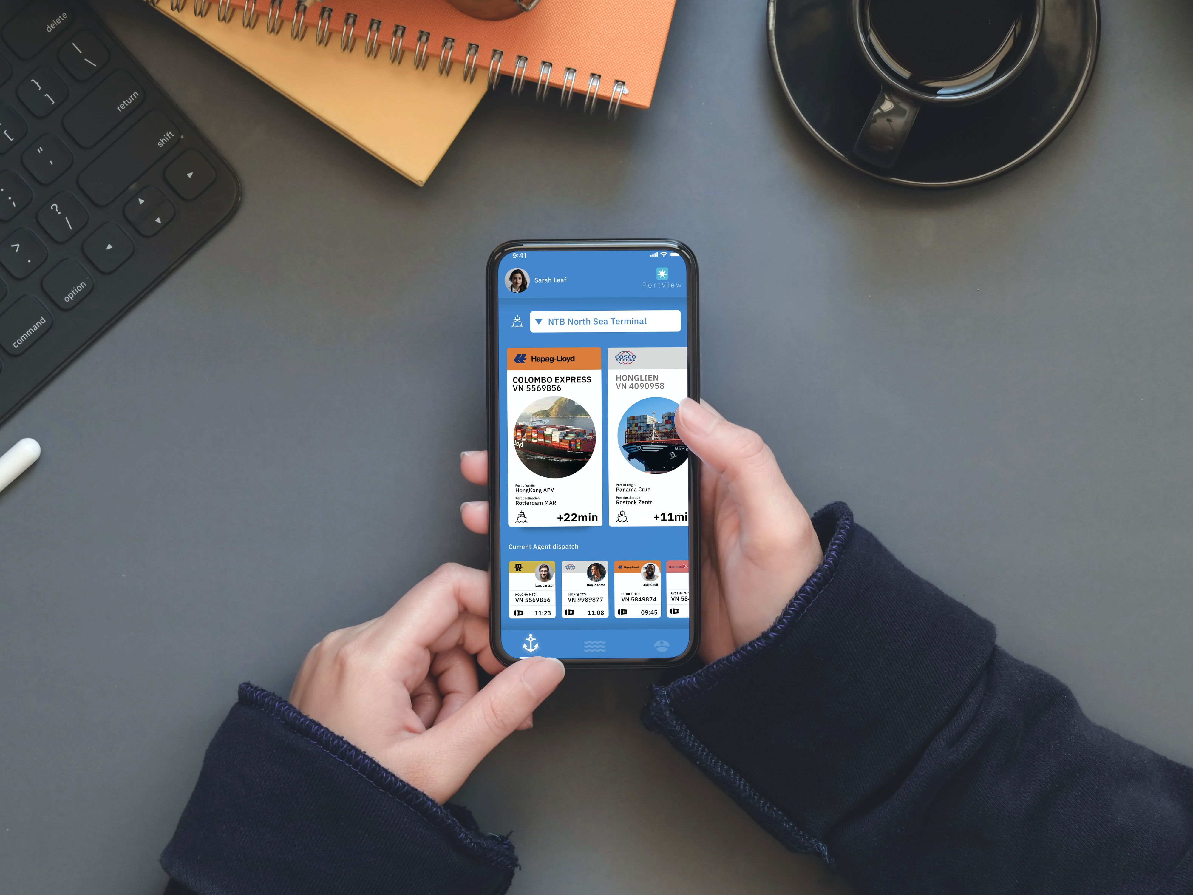
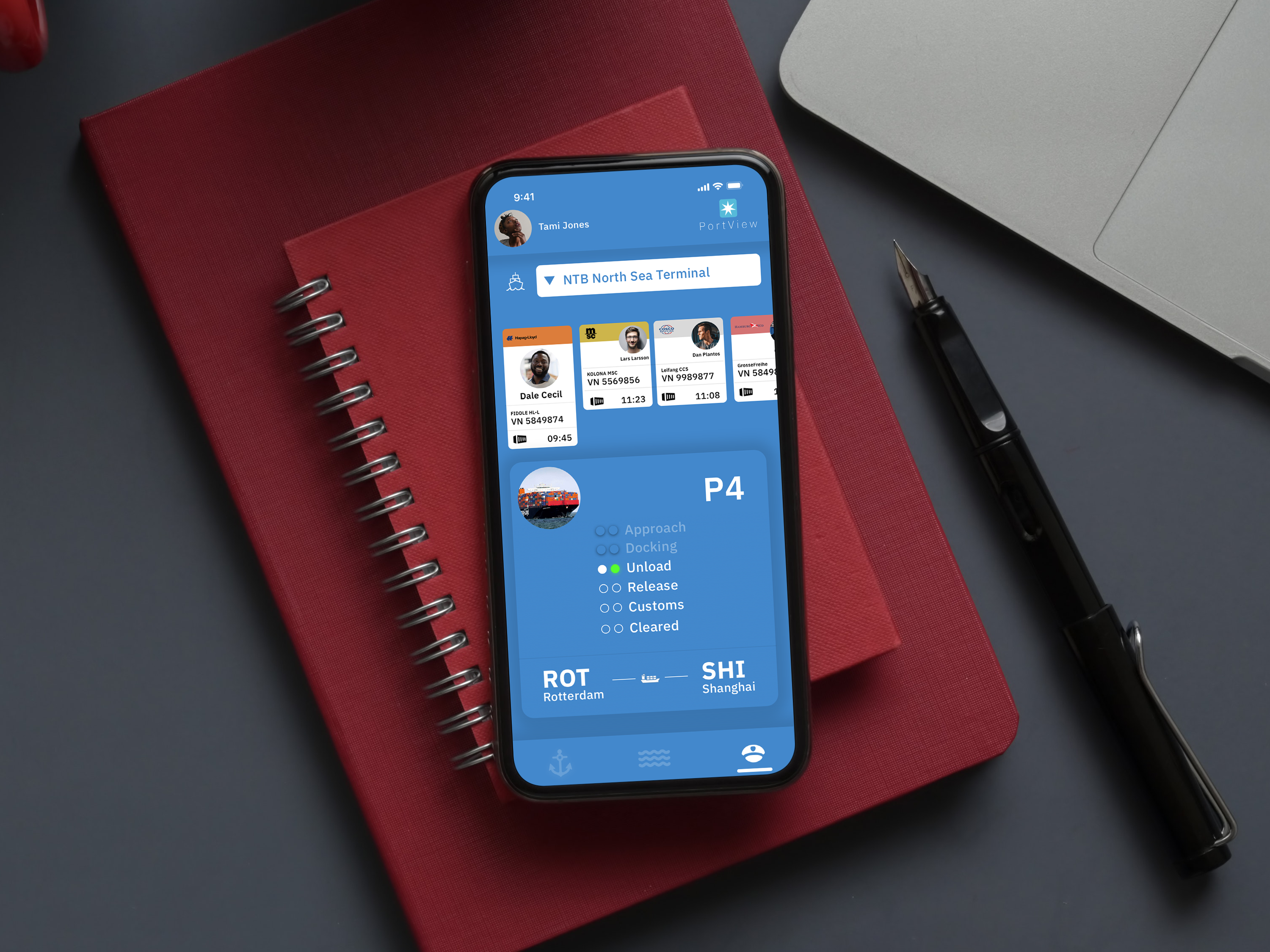
This application is a working tool for harbor operators to keep track of cargo ship traffic. The product is already available, but it was missing an ease of use with the overall task management flow. The question I tried to answer was to find ways for the tool to providing more clarity, where open tasks can be easily completed. I proposed anchoring this with visual cues separating each entry on a card rather than in a single list form, similar to an airline booking pattern.
Designed in 2019